
Design Your Wedding Photographer Website: Part 2 - Spacing

Have you ever walked into a store that immediately made you uncomfortable?
Maybe it was unorganized. Perhaps it was grimy, dingy, or dimly lit. Or it just felt chaotic and cluttered.
What was your first reaction? Did you want to buy anything? Did you turn around and leave?
As a wedding photographer, your website serves as your storefront. It is vitally important that your website is polished, professional, inviting, and prepared to impress whoever walks through your “digital” door.
One of the first aspects of web design a visitor will notice (whether it’s a good or bad first impression) is the spacing, or white space, on your website. Think of it like the “1-second snapshot” their brain will process first. It is the overall view they will take in before they begin to look at the details and read your website copy (text).
Today’s blog post, and part 2 in our series on designing your wedding photographer website, is all about how to optimize your white space! Let’s jump in.
White Space
White space is the area, or negative space, surrounding each item on your web page. Items on your web page include:
Headings and text blocks
Images
Graphics
Buttons
Lines and scrollwork
Marked section borders
White space doesn’t need to be white. White space simply refers to any blank space on the web page that provides a buffer around your blocks of content.
White space can be any color. Depending on the specific vibe you want on your website, you can primarily use neutrals such as white, cream, or grey or go bold with bright, rich colors. It’s entirely up to you and your brand style. As long as you can provide good text contrast, the background color doesn’t matter.
Just remember that bold, bright colors read as busier than soft colors. If you’re using bold colors as white space, you’ll want to increase the amount of white space even more.
Learn more about incorporating your brand color palette on your professional website in Part 1 of our blog series! Designing Your Wedding Photographer Website: Part 1 - Color
You can also use textured backgrounds or images that aren’t busy, highly-detailed, or visually overwhelming.
Here are two examples from my own website; I use a mottled peach background and a white marble background behind some of my sections.


Why White Space Matters
When it comes to your website design, the more white space the better. When you think you have enough … add just a little more.
Increased white space on a page has numerous advantages:
It reduces cognitive load, or how much information the brain needs to input and process in a given moment.
It increases readability and helps guide the reader’s eye down the page.
It improves user experience by providing rest for the viewer’s eyes as a “visual breather.”
It increases comprehension, as the reader can focus on one thing at a time instead of feeling content overload.
It improves the overall balance and aesthetic of the web page.
It increases the professional appearance and credibility of the website.
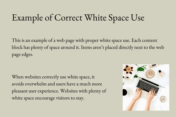
Let’s take a look at these examples of poor and correct white space use.
The poor white space image looks chaotic and cluttered and increases overwhelm. It is hard to know what to look at first.
The correct white space image allows our brains to breathe and calm down. It is easy to move from one subject block to the next.

Keep reading … ⬇️
Not only do you want plenty of white space around your content blocks, but you also want to ensure your content blocks aren’t too close to your browser edges. Many web platforms will have a setting that controls your web page spacing for the entire website. Here is an example of Squarespace’s web page settings.

Page Width (Max) refers to the width of the space you can place content blocks in.
Site Margin refers to the “gap” between your page width and the border of the browser window.
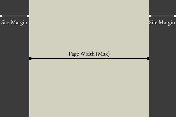
These two work values work together:
As you increase your browser window width, your page width (max) will stay the same (at the max value that you set), and your site margin will increase in size.
As you decrease your browser window width, your site margin will shrink until it reaches the “Site Margin” value that you set. Then, your page width will begin to reduce and content within that space will re-arrange.
Clear as mud, right?
Don’t worry too much about these values. For the sake of white space along the edges of your browser window, you want to pay attention to what your “site margin” is set at. For more space, increase the value.
Ultimately, the tip to white space is that “more is more.”
Your website should incorporate ample white space to provide a high-quality user experience. When in doubt - add a little more.
If this sounds too complicated or overwhelming, you’re not comfortable editing your website, or you’re ready for a total website makeover - learn more about my Peach and Pine Experience and schedule your complimentary consultation! I’d love to design a professional, high-converting website for your business, so you can leave the website design & strategy to me, and instead focus on what matters most.
As always, if you have any questions or additional ideas for a blog post, send me a message!
Cheering for you!
Kylee
Don’t want to miss when a new blog post gets shelved?
Join my inbox community and receive the Peach and Pine Post, a twice-monthly newsletter with links to recently published blog posts plus tips, tricks, and insider info about marketing, SEO, web design & strategy, copywriting, managing a small business as a real human being, and so much more! See you there!