
Design Your Wedding Photographer Website: Part 4 - Text

Close your eyes for a second (after you read the next sentence).
What do you imagine when you read the words 1970s retro? (Now close your eyes.)
What popped into your mind?
Flower power? Tangerine orange, sunshine yellow, and olive green? Big, bold, colorful artwork? Fun bubble fonts? Block letters?
Just like those groovy fonts from the 1970s, the fonts you choose on your website can leave a lasting impression.
Part 4 of our blog post today is about choosing fonts for your professional wedding photographer website!
Psst - even if you’ve worked with a branding specialist and already have a groovy set of fonts for your brand, you may learn a few tips and tricks on how to install those fonts, so stick with me and keep reading!
Types of Fonts
When it comes to your website, you should have no more than 3 fonts. Any more, and it begins to look messy, incohesive, and DIY.
You will pick one font from each category:
Heading fonts
Body text fonts
Script fonts
Heading Fonts - Required
These are the fonts that make up your website headings. These fonts let you show off your brand personality, while still being easy to read. They can be minimalistic, bold, or stylized. And like everything else on your website, what you choose should match what your brand style and vibe are. Here are a few examples of heading fonts!


Body Fonts - Required
Body fonts make up all of your “paragraph” text. This should be a font that is very comfortable to read. This font should be different enough from your Heading Font to be easily distinguishable.
Typically, you will choose either a serif or sans serif font.
Serif fonts: serif fonts have small extensions (called serifs) at the end of each stroke. Popular serif fonts include Times New Roman and New York.
Sans serif fonts do not have small decorative extensions on the end of each font. Popular sans serif fonts include Arial and Helvetica.


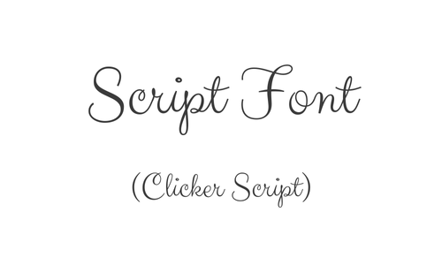
Script Fonts - Optional
Script fonts are calligraphy fonts that appear like handwriting. These fonts can be difficult to read and are optional on your website. If you do choose to use a script font, use it sparingly for 1- or 2-word salutations such as, “Hello” or “Welcome.” Never use script fonts for complete sentences.
If your web platform limits your font choices to Heading and Paragraph fonts, you can use platforms like Canva to create PNG or JPEG images of your script salutations. Then, upload the graphic onto your web design platform and add it as an “image.”


Examples of Font Pairings
Here are a few examples of different font pairings for inspiration.
In addition, if you’d like more help determining which font pairings would work best with your brand style, you can use The Color Palette Studio’s Font Pairing Kit! (Those are both affiliate links - enjoy 10% off on me!)


Installing Your Fonts
Once you’ve decided on the fonts for your website, it’s time to install them!
Here are the best practice tips I recommend. These are beneficial for SEO and design.
Text Classification
Do you remember writing outlines in high school before you wrote a research paper? You’d have the title, headings, and subheadings.
For example, here’s an outline:
Title: Squarespace is a Superb Platform for Wedding Photographers
Ease of Use
Starting Points:
Begin from a template and completely customize
Start from scratch
Design Your Website:
Drag and drop features
No code
24/7 chat support
Built - In SEO
In-platform Integrations
Google Analytics Integrations
Additional Services
Email marketing
Marketing Integrations
Google Workspace
Just like that example, when structuring your website, your text (copy) should follow a basic outline structure down the page. This helps web crawlers categorize your page information and assign level of importance to your sections. Web pages with appropriate outline structure have better SEO scores. In addition, correct outlines increase accessibility by allowing page readers to understand the page format.
So, how do we correctly outline a web page? We use headings and paragraph text.
Web platforms typically classify heading sizes as H1, H2, H3, H4, etcetera, and paragraph text sizes as P1, P2, P3, and so on.
Your largest fonts in each set should be H1 and P1. Your fonts should decrease in size for each additional step.
Squarespace provides 4 heading sizes, listed as H1 to H4, and 3 paragraph sizes listed as P1 to P3.
Heading hierarchy is extremely important on web pages. This is the general structure you should follow:
H1 headings: your page title or tagline.
You should only have one H1 heading on your page.
H2 headings are for overall categories
H3 headings are for subcategories within H2 headings
H4 headings are for subcategories within H3 headings
With that in mind, let’s use our outline example from above and assign heading categories!
H1 Heading: Squarespace is a Superb Platform for Wedding Photographers
H2 Heading: Ease of Use
H3 Heading: Starting Points
H4 Heading: Begin with a customizable template
H4 Heading: Start from scratch
H3 Heading: Design Your Website:
H4 Heading: Drag and drop features
H4 Heading: No code
H3 Heading: 24/7 chat support
H2 Heading: Built - In SEO
H3 Heading: In-platform Integrations
H3 Heading: Google Analytics Integrations
H2 Heading: Additional Services
H3 Heading: Email marketing
H3 Heading:Marketing Integrations
H3 Heading: Google Workspace
It is important to note that not every web page will use all the heading sizes.
While all web pages should have one H1 heading (as the title or tagline text), many web pages will only need H2 headings on the rest of the page.
The key is to not skip heading sizes (for example, going from H1 directly to H3).
Keep reading … ⬇️
Your paragraph fonts have more flexibility and don’t need to follow a specific hierarchy. My typical paragraph font is P2. I use P1 fonts when I want a sentence to stand out. I typically use P3 fonts, which are the smallest, for labels or descriptions.
Now that you know how to correctly use your heading and paragraph fonts, let’s discuss how to select text sizes.
Selecting Text Size
You’ll see two measurement forms for text size: pixels (px.) and rems. Pixels are an absolute value - a heading set to 35 pixels will always be 35 pixels. Rems are relative to the size of objects around them. By default, 1 rem is typically 16 pixels.
Regarding web design, rems are preferred; you want the text size to adjust appropriately as your website is viewed on different devices: desktop vs. tablet vs. mobile device.
Many web platforms will have you set a “base size” text in pixels. This serves as a baseline for all the rems settings you will adjust. For readability, this value should be no smaller than 16 pixels, although some fonts may be better at 18 pixels. Use your discretion on what you think is easier to read with the font you’ve chosen.
Your headings (especially H1 and H2) should be quite a bit larger than your paragraph text. A general “rule of thumb” is that your headings should be at least 1.3x as large as your paragraph text.
Generally, you want each size to be distinguishable from the others in its category (heading to heading and paragraph to paragraph). It is okay to have some overlap between your smaller heading fonts and your larger paragraph fonts.
Here is an example of heading settings and what they look like visually.


When choosing exact sizes for your own website, I recommend creating a “Palette” page that lists each type of text, like this:
Heading 1
Heading 2
Heading 3
Heading 4
Paragraph 1
Paragraph 2
Paragraph 3
Then, assign each type of text to the appropriate words — aka, assign H1 to “Heading 1.”
Lastly, go into your heading and paragraph size settings and play around until you find a balance you’re happy with! Just know that these will be the font settings across your whole platform.
General Rules for Text On Your Website
This last section covers basic ground rules for installing your text on your website.
Any text longer than 2-3 lines should be left-justified, not centered.
Avoid walls of text: your text should never expand across the whole web page.
Break up blocks of text by using line breaks, bulleted lists, images, and headings.
Let your heading and paragraph placement guide readers down the page as they read.
Each thought or topic (such as your headings or subheadings) should be in its own section, and sections should be differentiated.
Make sure your text color is high-contrast (learn more: Design Your Wedding Photographer Website: Part 1 - Color)
Pay attention to the white space around your text (learn more: Design Your Wedding Photographer Website: Part 2 - Spacing)
Congratulations! You now know how to choose and install fonts on your wedding photographer website.
If you have any questions or an idea for a blog post, send me a message.
I know you’re busy. If you don’t have time to spend designing your website but you’re ready to take your business to the next level, it’s time to hire a professional.
My Peach and Pine Experience is a custom, comprehensive web design build. I specialize in wedding photographer websites and incorporate powerful psychology-based copywriting, strategic web strategy, and aesthetic design.
If you’re ready for a website that serves as a powerful business asset and markets for you 24/7/365 to book your dream clients, schedule your complimentary consultation!
I can’t wait to visit with you and learn about your business goals and dreams!
And as always - I’m cheering for you!
Kylee
Don’t want to miss when a new blog post gets shelved?
Join my inbox community and receive the Peach and Pine Post, a twice-monthly newsletter with links to recently published blog posts plus tips, tricks, and insider info about marketing, SEO, web design & strategy, copywriting, managing a small business as a real human being, and so much more! See you there!